Atlanta' s Charming Neighborhoods


A model to measure and visualize neighborhood quality in the city of Atlanta by mining social media

Learn More

Explore neighborhoods of Atlanta


Visit the interactive map webpage with visualization of
our data analysis results for the City of Atlanta!

Get Started!

Scenarios


Twitter API

Twitter posts about neighborhood characteristics

Case Study

Model and data analysis on Tweets from the City of Atlanta

Visualization

Analysis result visualized in a 3D interactive map

Methodoloy

How we deal with data and do analysis

  • Data Crawling

    Data are collected using streaming API offered by Twitter. Keywords related to the neighborhood characteristics are identified with the help of local periodicals. Tweets with positive and negative attitude are extracted.
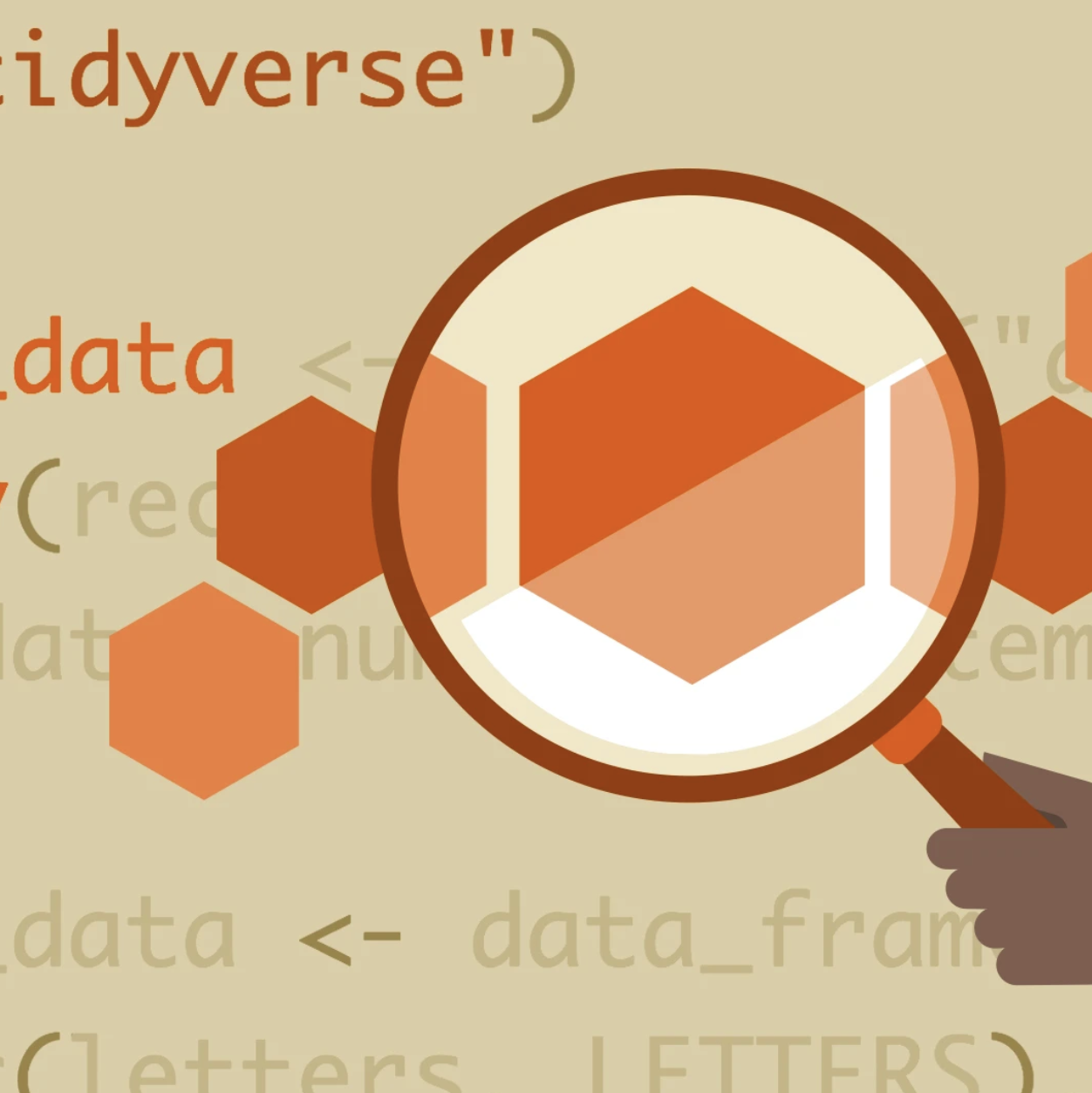
  • Elaboration

    Texts are transformed into a set of numeric vectors to train the machine learning models developed by (tokenization, stop-word filtering, stemming, feature representation) CLiPS
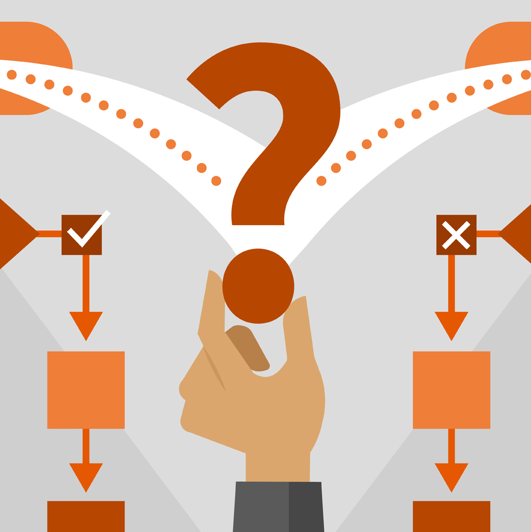
  • Classification

    Neighborhood-related Tweets are classified into 5 categories: public safety, transportation, Aesthetics, Shopping & Entertainment and Walkability
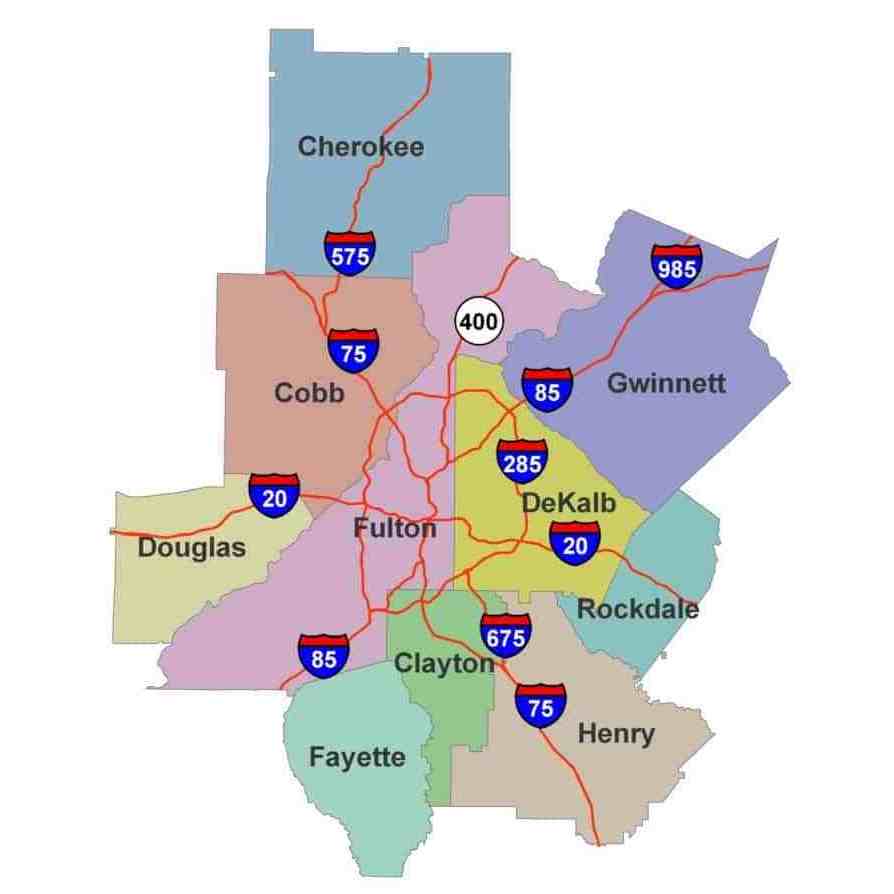
  • Data Comparison

    Derived neighborhood perception is compared with data avaliable in Atlanta's Neighborhood Quality of Life and Health Portal, which is measured at neighborhood planning unit (NPU) level

  • Visualize
    charming
    Atlanta !

Our Amazing Team

Subhro Guhathakurta

Director

Gordon Zhang

Research Scientist

Guangxu Chen

Master of Computer Science

Yiou Zhu

Master of Computational Science and Engineering

Caroline Burnette

Master of City and Regional Planning

For nearly 20 years, the Center for Spatial Planning Analytics and Visualization (previously the Center for Geographic Information Systems - CGIS) has been at the forefront of collaborative interdisciplinary research for local, state, national, nonprofit, and private entities accoss the nation and the globe.